Sqope
About
Sqope is a company that provides information about large food companies. This is useful for newer companies that wish to enter the retail market. While working with Sqope I created a special dashboard that provides the client relevant data for their specific needs.
#Dashboard #Visual language #UX #UI

Client & Analyst Dashboard
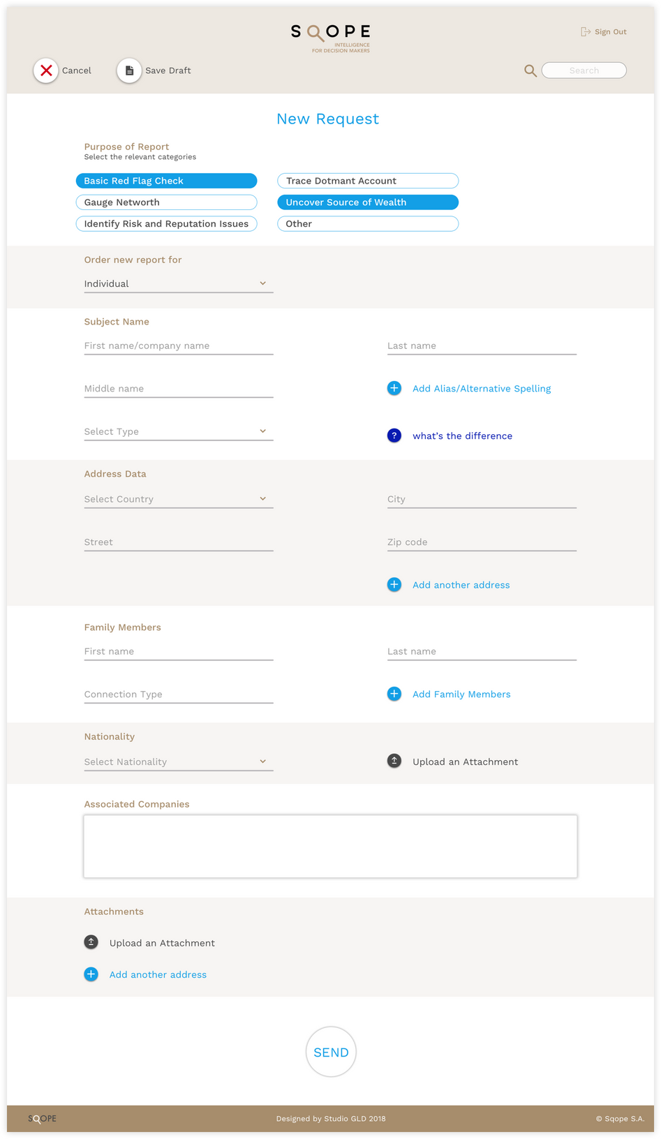
The interface is simple and easy to operate, through it the company's base data can be linked and as a result, the company receives weighting data based on existing food companies.

The Solution
I decided to utilize a set of icons to guide the user through various processes. Each “call to action” is accompanied by a dedicated icon. For improved user engagement I wanted to create large and unique icons that better connect the user to the interface, and get them actively working on the dashboard. In addition, the informational sections in the dashboard are divided by colors, which help the user focus and read continuously.

Visual Language
The same color distribution was used in pop-up pages, which helps in keeping a focus on the currently active parts, while leaving a connection to the inactive parts. I colors chosen were aligned with the company’s branding strategy.

All Projects


